
A refreshed brand identity and architecture for one of Riyadh’s most trusted printers
With 25 years of experience and a reputation for delivering precision and quality, Marina Inc. Printers sought to clarify and elevate their identity. -scope Ateliers was invited to rethink the brand from the ground up, with particular attention to its structure and future-facing positioning.

Marina Inc. Printers’ new logo
Marina Inc. Printers’ old logo
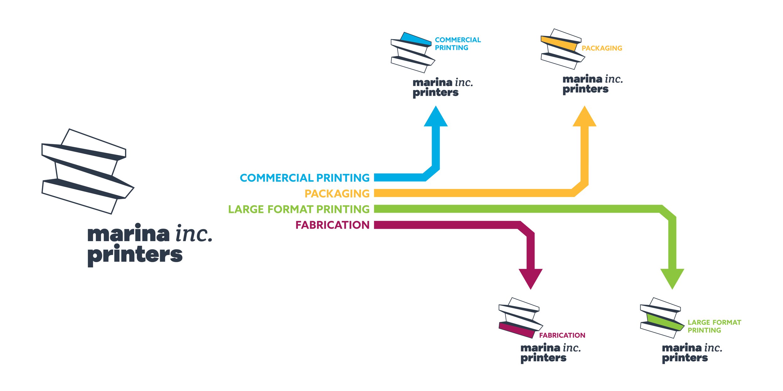
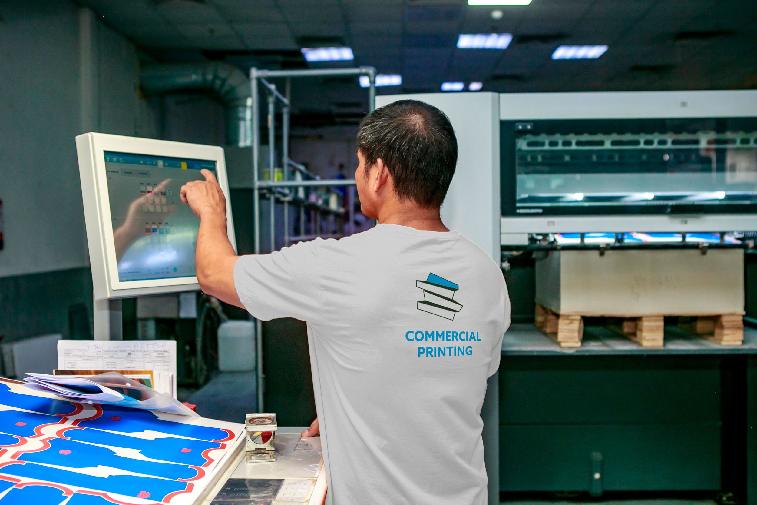
Drawing on the logic of the existing emblem—four stacked blocks—we introduced a refreshed brand architecture that gave each of the company’s divisions (Commercial Printing, Packaging, Large Format Printing, and Fabrication) its own distinct color and visual cue.
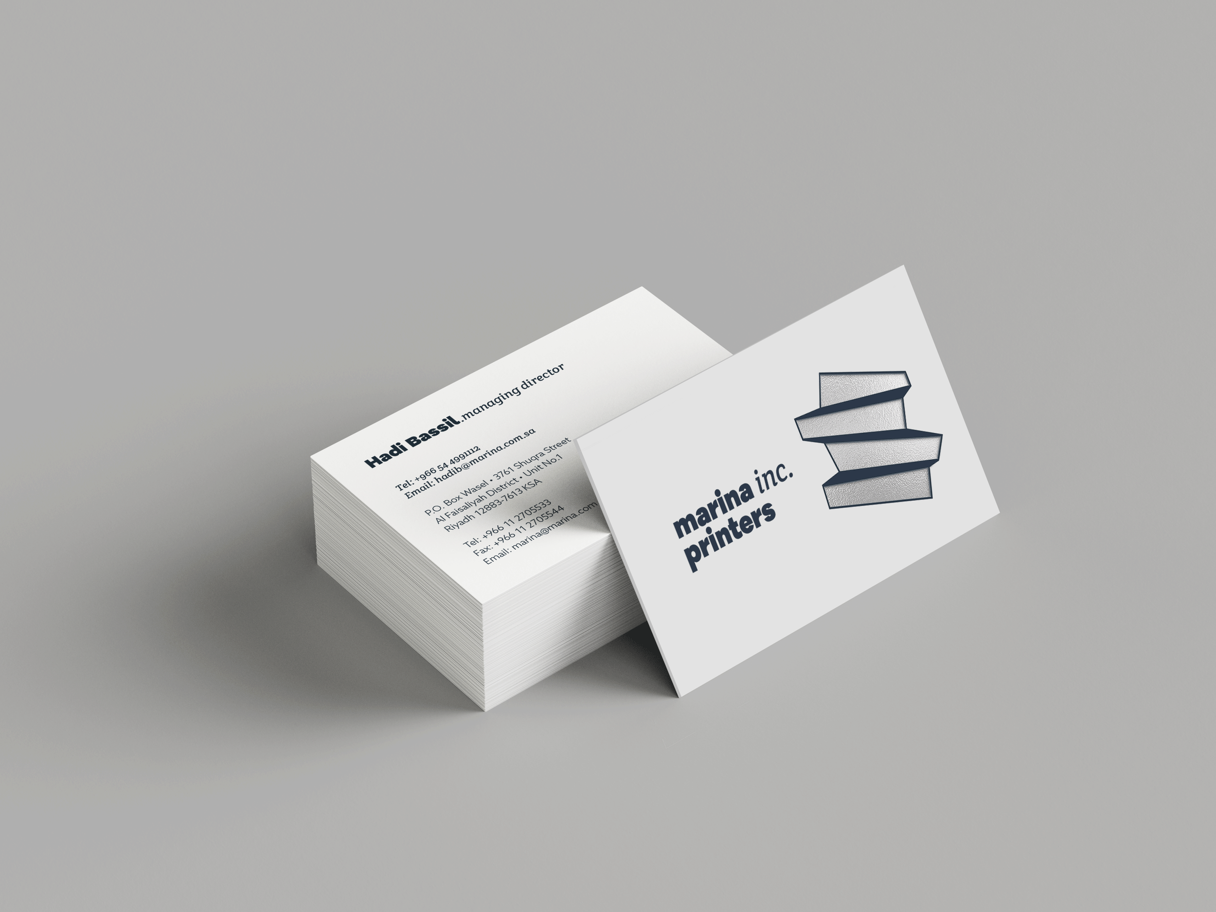
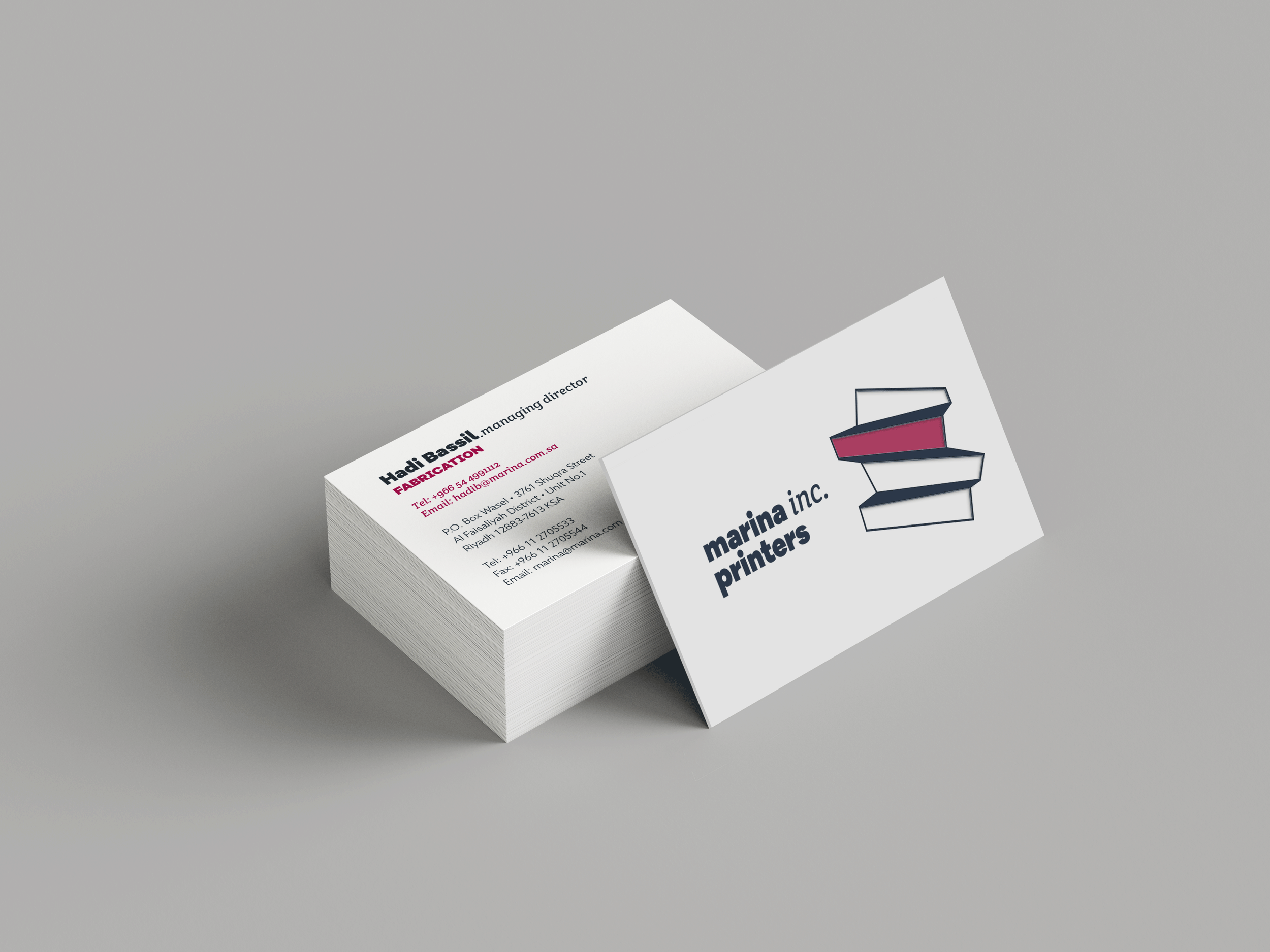
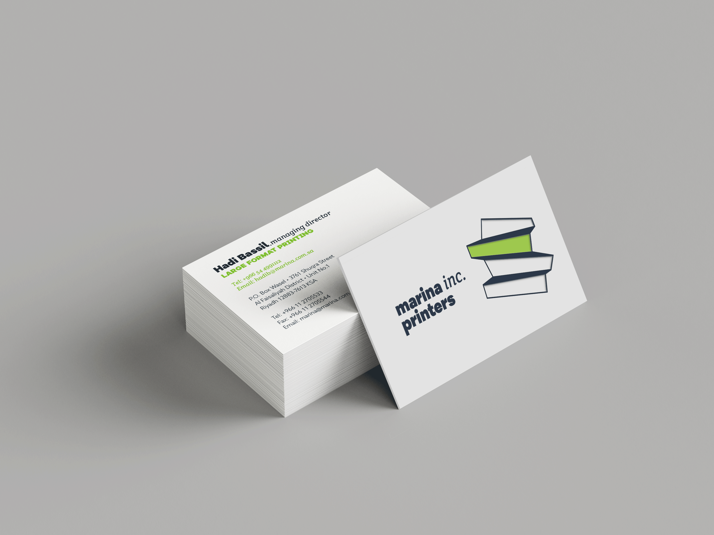
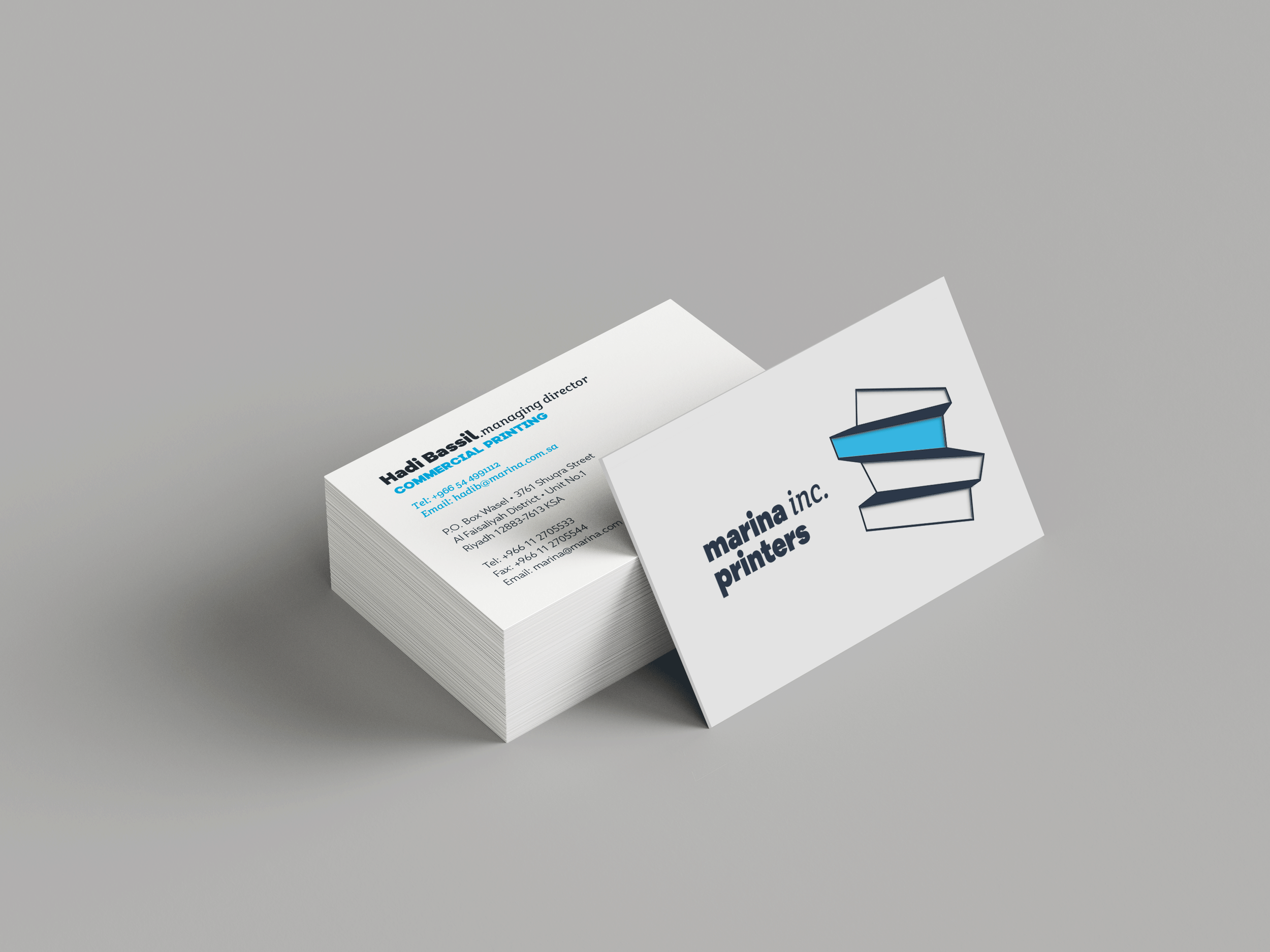
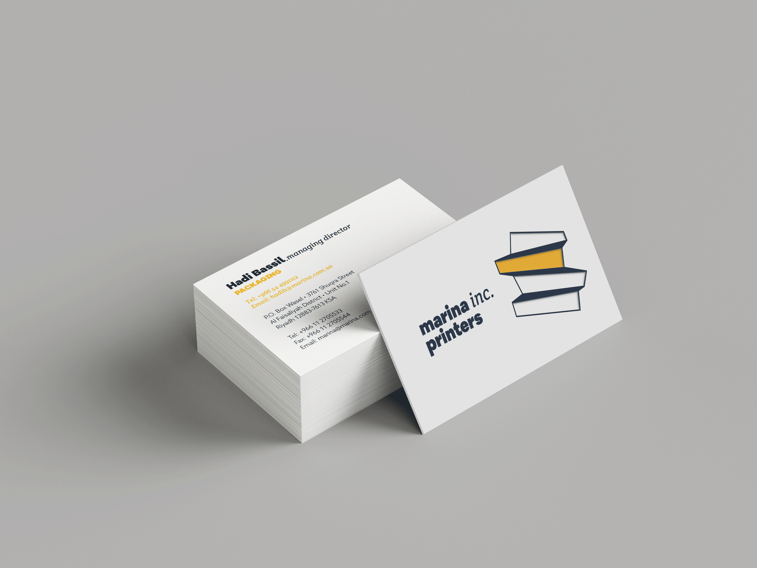
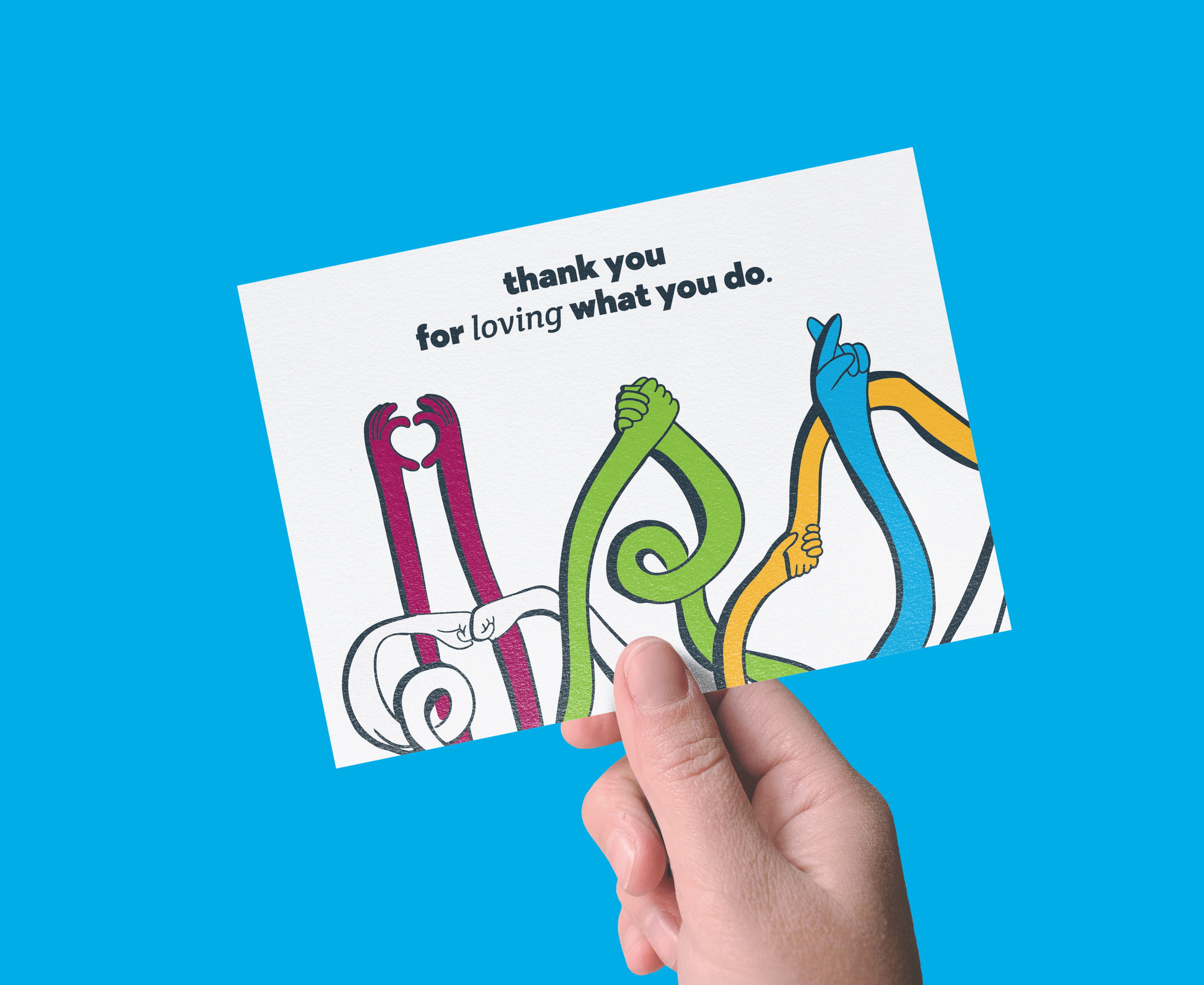
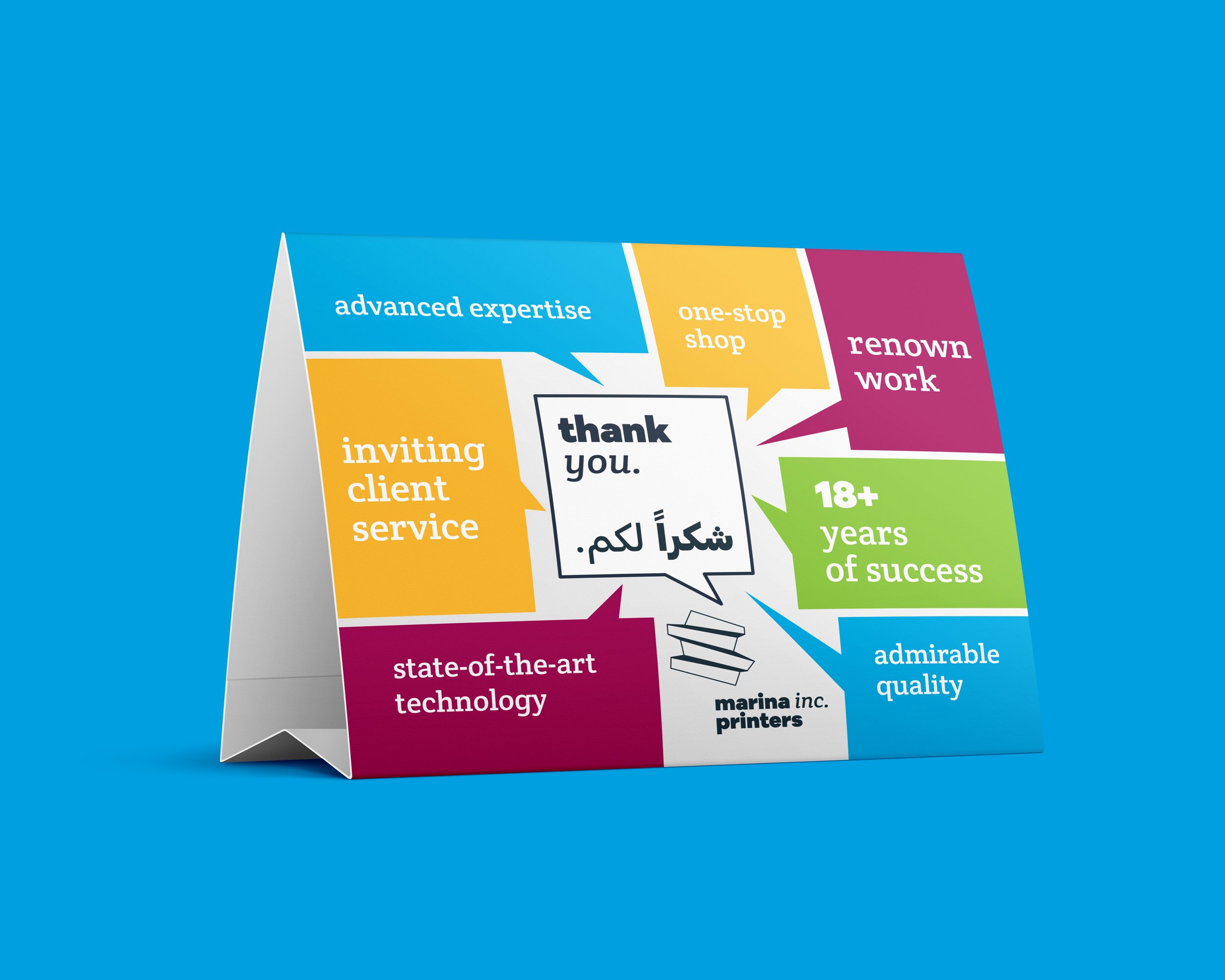
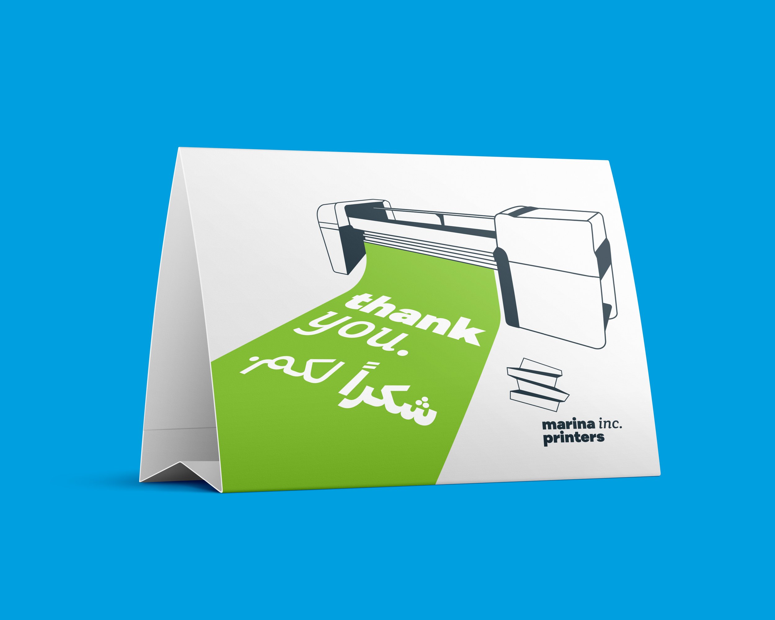
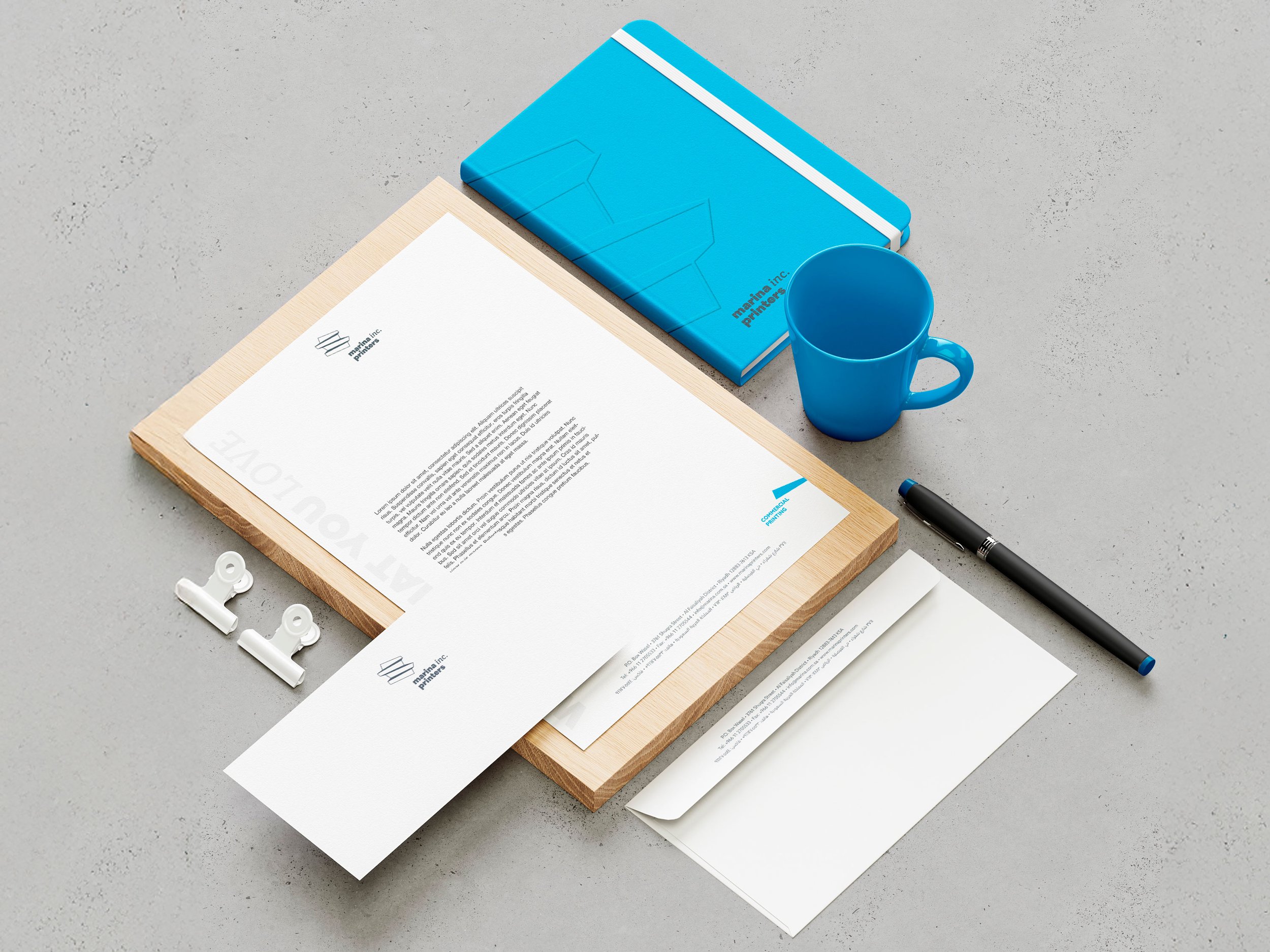
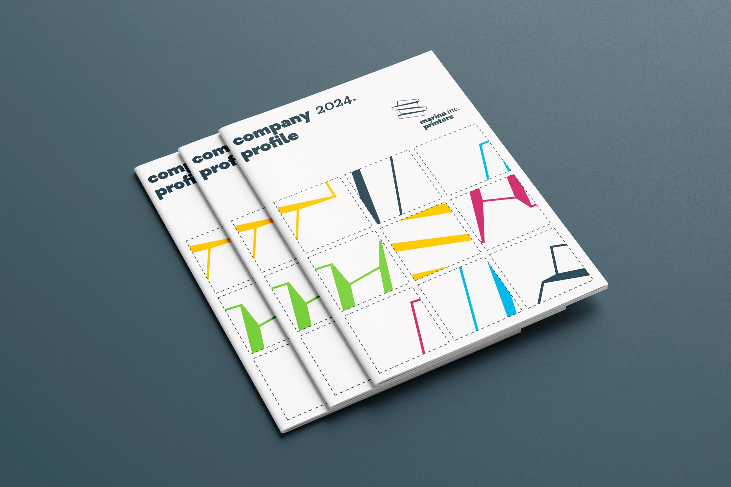
The identity builds on Marina Inc.’s existing emblem, reinterpreting its four stacked blocks as a three-dimensional form that conveys structure, precision, and depth. This logic extends into a clear brand architecture, where each division is assigned a distinct color and visual cue, allowing the system to remain legible while accommodating complexity. A streamlined wordmark, modular icons, and illustrative elements ensure consistency across digital and physical platforms, expressing both technical expertise and adaptability.

The challenge was to modernize a well-established printing company without erasing the equity built over 25 years. The identity needed to clarify multiple business divisions, support future growth, and remain flexible across varied applications, all while preserving Marina’s reputation for reliability, precision, and client-focused service.
Scope of work